Written by
KIVRA Studio
Reading time
3 min read
Format
Studio note
Motion is one of the fastest ways to give a website personality, and one of the fastest ways to make it tiring. The difference is usually restraint: fewer moving parts, shorter durations and a clear reason for every transition.
Motion should explain
A good transition shows where something came from or where it went. A subtle lift on a card says it can be opened. A short fade on a heading says the page has settled. Anything that moves without explaining something is decoration.
Respect the reader
Keep entrance animations under a second, never block reading while something animates, and always honor reduced-motion preferences. The best motion is felt more than it is noticed.
Written by KIVRA Studio. Questions or thoughts? Write to hello@kivra.studio.


Let’s talk

Every brief is read by a person, not a pipeline. You get a clear next step — not a sales call.
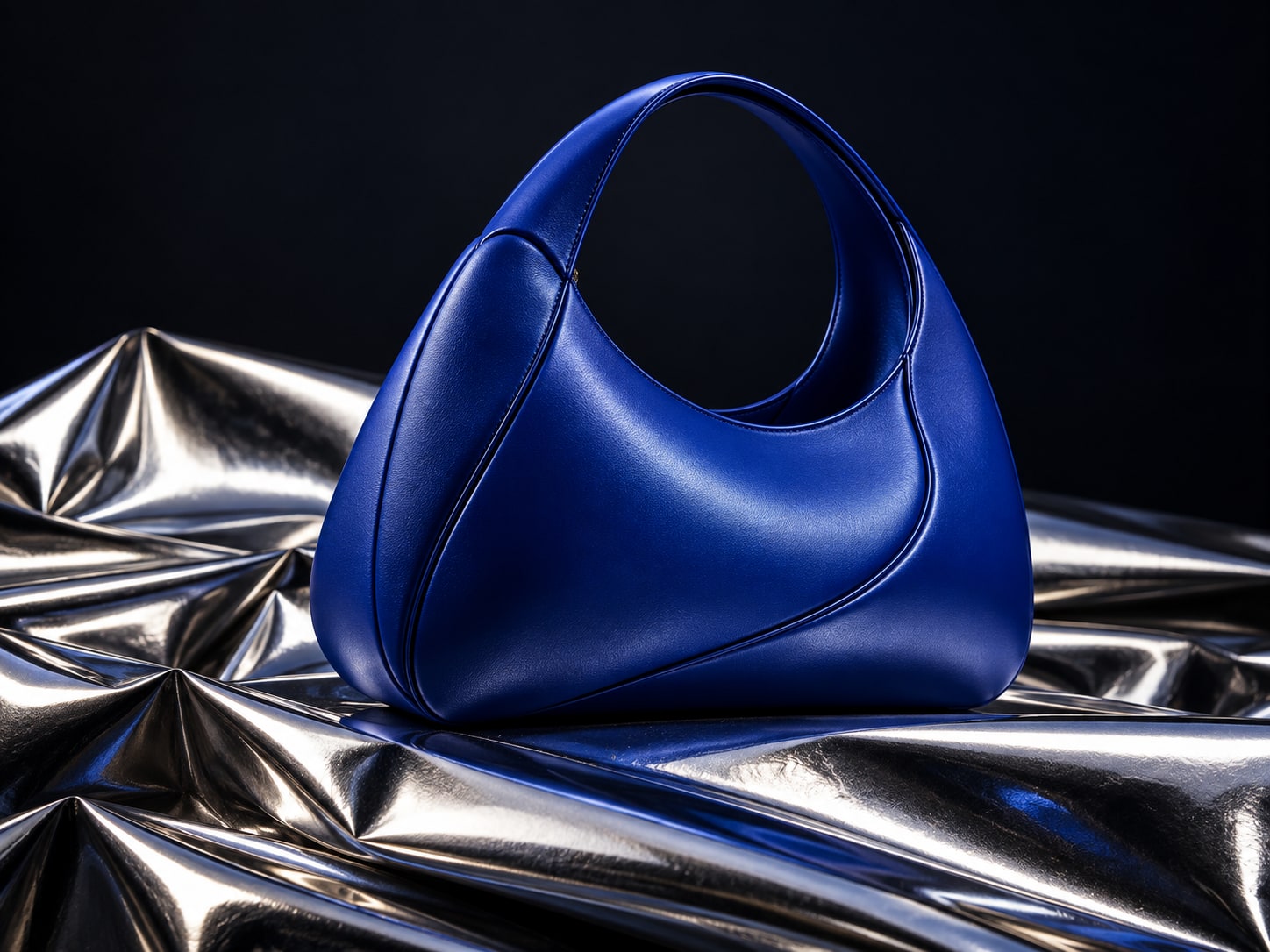
Studio — concept image
Contact
Tashkent, Uzbekistan — working worldwide

Let’s make
it clear.
Whether you have a full brief or just an idea — we help shape it. No pitch decks, just a clear next step.
Visit us
Tashkent, Uzbekistan
Mon–Fri · 09:00–18:00
By appointment